At an intimate leadership dinner not long ago, the conversation turned to professional identity. Each woman shared the journey that had brought her to her current role and the challenges she still faced navigating leadership in a new environment.
One woman spoke with a mix of honesty and frustration. Back in her home country she had held a senior position and was widely recognised as highly capable. Yet here, despite performing well and carrying real responsibility, she was consistently perceived as “junior.”
Trying to compensate, she began relying almost entirely on dark colours — mostly black. She believed black communicated authority, competence, and seriousness.
Symbolically, she was right. But something else began to happen. Instead of feeling more confident and respected, she started to feel increasingly distant from others.
That evening she wore what she described as her “can’t go wrong” outfit: a black turtleneck, black jacket, black trousers, and black shoes.
Her presence, however, told a very different story. Her posture was open. Her energy was bright and agile. Her voice was warm and animated. She spoke with enthusiasm and expressed ideas with lively gestures.
Yet her outfit communicated something else entirely. There was a quiet mismatch between what she projected and what she wore.
People can sense this kind of dissonance immediately, even if they cannot explain it. Something simply feels slightly “off,” as if the internal message and the external signals do not fully align.
What Research Suggests
Studies in colour psychology and social perception show that clothing communicates subtle emotional signals.
Very dark, low-contrast outfits — especially head-to-toe black — can sometimes create unintended impressions.
While black can communicate seriousness and authority, it can also increase perceptions of distance, reserve, or defensiveness when the wearer’s natural personality does not match that message.
In leadership or relationship-driven roles, this can subtly weaken approachability and connection.
Black is powerful. But power without warmth is often read as rigidity.
A Visual Example
Let’s look at a few examples. When people evaluate confidence and professionalism, they rarely analyse clothing consciously. Instead, they read visual cues such as contrast, openness, structure, and colour balance.
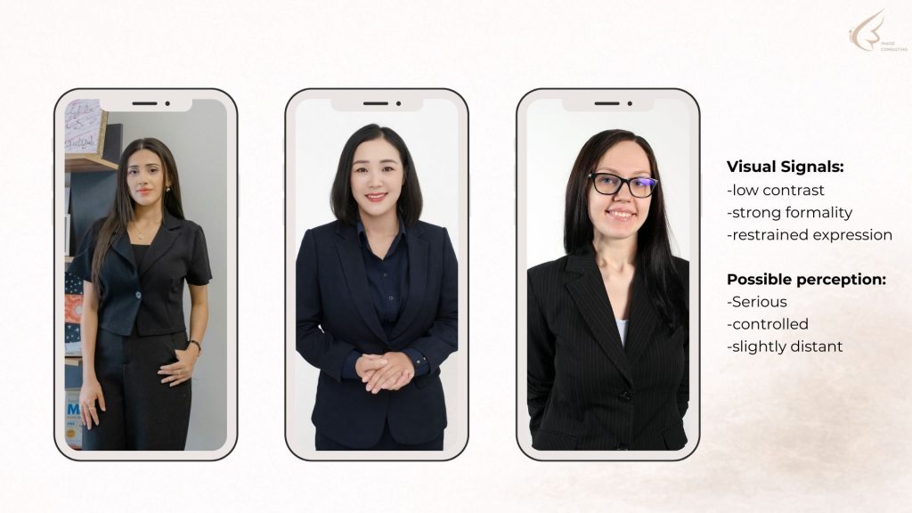
Even though these outfits follow traditional “professional” rules, the women appear slightly tense or disconnected from their natural presence.
When Style and Self Fall Out of Sync
Every outfit carries psychological signals. Colour, structure, fabric, and contrast communicate energy, temperament, and intent.
When those signals contradict your natural presence, your message becomes diluted — no matter how capable or confident you are.
This is why the question should never begin with: “What should I wear?”
A far more revealing question is: “Who am I when I feel most like myself?”
Style begins with an agreement between your inner identity and your outer expression.
Adjusting the Signals
When colour balance, contrast, and structure begin to align with personality, something subtle changes.
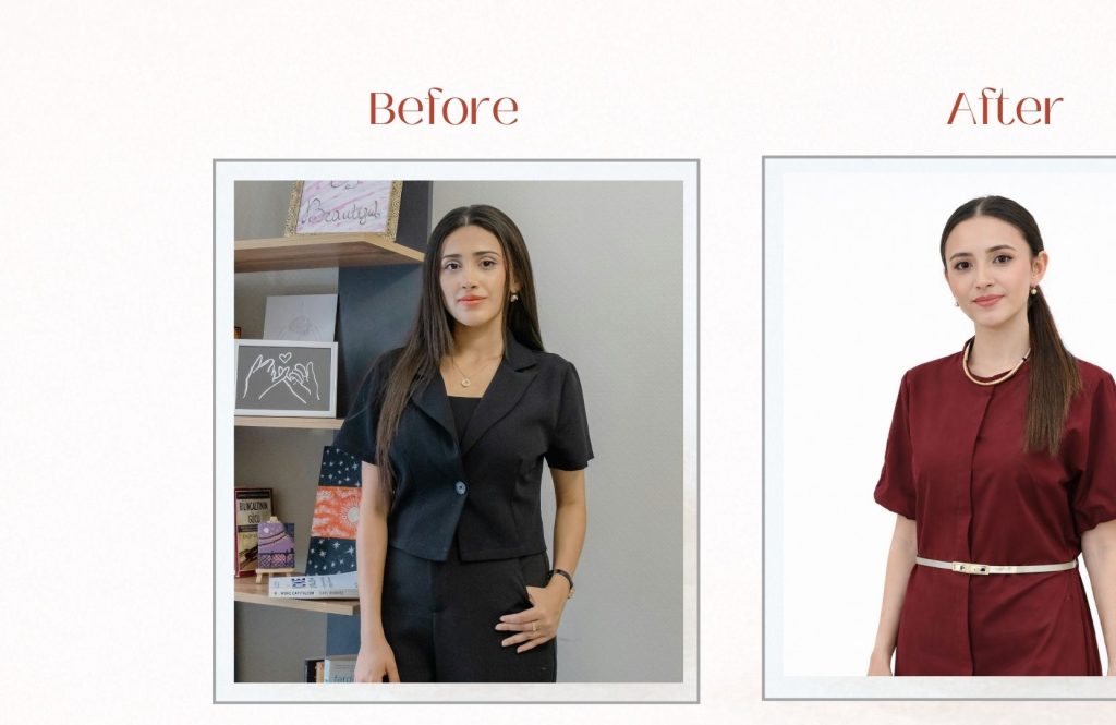
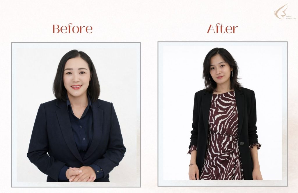
Their new visual signals: balanced contrast | visible personality | relaxed structure
Possible perception: confident | approachable | authentic
The goal is not to abandon dark colours entirely. Instead, it is to create balance — through contrast, texture, or thoughtful styling details.
A Simple Way to Check If Your Outfit Supports You
When choosing what to wear for a professional setting, ask yourself three questions.
1. Energy: Does this outfit reflect the natural energy I bring into the room?
2. Alignment: Do my clothes reinforce the role I want to be perceived in?
3. Authenticity: Do I feel like myself in this outfit?
When these three elements align, credibility becomes effortless.
A Simple Way to Check If Your Outfit Supports You
In image consulting we often talk about impression management. But the deeper work is actually impression alignment.
Clothing should not perform on your behalf. It should reinforce what is already true about you.
Professional presence is not about dressing up. It is about dressing in — into your identity, your values, and the version of yourself that feels most at ease in your own skin.
When your clothes and your character move in the same direction, confidence is no longer something you try to project. It simply becomes visible.
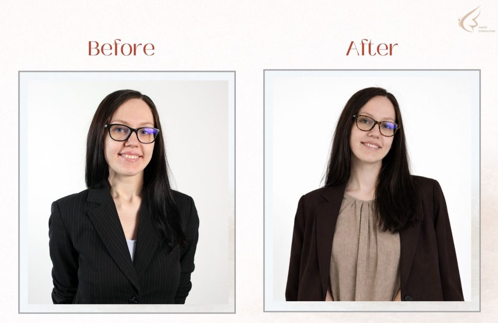
A Simple Example of Contrast
Often a small adjustment can make a surprising difference — even when the colours in your wardrobe remain the same. Here is a simple example from my own wardrobe that illustrates how contrast influences perception. Sometimes the difference between blending in and being seen is simply a small shift.
Contrast creates visibility. And visibility shapes perception. Even a subtle change in contrast can transform how an outfit communicates — without introducing brighter colours or dramatic styling.
In Short
A strong professional image is not about choosing between black, blue, red, or beige. It is about choosing between masking who you are and magnifying it.
Colours are not there to protect you. They are there to reflect you.
And when that reflection feels right, professionalism, confidence, and impact follow naturally.
Understanding how visual signals influence perception is something we explore often in my workshops and consulting sessions.
If this topic resonates with you and you would like to explore how colour, contrast, and personal style influence the way you are perceived, I will be hosting a small Style workshop on March 28th in Woerden (Utrecht area).
In this interactive session we explore how visual signals and personal style — shape presence and confidence.
There are a few places still available, and I always keep the group intentionally small so everyone receives personal guidance.
You can find more information here: Style Workshop
Enjoyed this article?
I occasionally share reflections on professional presence, style strategy, and upcoming workshops.
Stay Connected: